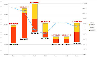
1. Scaling the Y-Axis

The Y-axis scale needs to be set so that you can see the starting and ending dates in the timeline.
Set the chart to intervals of 61 days, alternate months are normally either 30 or 31 days.
So I use a bi-monthly interval of 61. How neat is that ??? This is because my chart counts in days.
Its a bit awkward to set a monthly interval. Its not very much more awkward to use a weekly interval or yearly interval. The chart is useful anyhow.
2. Formatting the starting and ending date text. This is what you want to see straight off the bat. Use a nice bold font like an Accent SF font.
2. Formatting the starting and ending date text. This is what you want to see straight off the bat. Use a nice bold font like an Accent SF font.
To get a picture perfect Gantt chart.It customary to rotate the axis by 90 degrees so that the time line is horizontal, rather than vertical. Unfortunately I don't think a method exists to do that yet in Open Office 3.0. You can take a printout though and flip the chart in the book ;). This simple Gantt chart will give you all the minimum information you need to plan and forecast, as well as auto-updating the chart when your time frame changes.
If you like this article please do leave your feedback and suggestions.

No comments:
Post a Comment