This is an important (and confusing) topic.
If you feel frustrated at any time you can Undo the last step with the Ctrl+Z shortcut.Carefully follow my advice, and with just the
help of Open Office, you can transform
your timelines into an inexpensive
but splendid looking Gantt
Chart.
The chart updates automatically at any changes in the source data tables. I have never seen this even in professional Gantt tools. Ah ... the wonder of Open Source!
1. Select the chart with a double click.
2. Formatting the Y -axis :
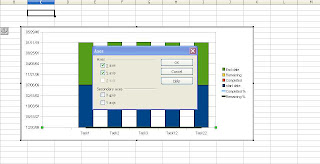
With the mouse select the Y-Axis to bring up the Y-axis format dialog box.
This dialog box can also be called from the Format
Menu -> Axis -> Y-Axis.
in the dialog box and uncheck the Source Format checkbox. ( I think this is a bug in Open Office... but what do I know ?).
b. Now manually select the date format for the Y-axis.
c. Click OK when Done.
The chart changes to reflect the tasks by Date.
3. Now we have suddenly discover that our plots are wrong,
because our data series table actually has two Y-Axis on different
scales and dimensions. Albeit it shows the same unformatted scale as the primary axis.

No problem.
From the Insert Menu -> Insert Axes -> Select the secondary Y-Axis checkbox and click OK , a secondary Axis is generated,
Format the secondary Y-Axis scale by selecting it with the mouse or from the menu Format ->Axis-> Secondary Y-Axis ...
Now un-check automatic checkbox, and change the scale Minimum to 0%, the scale Maximum to 100% and scale interval to 10%.
In the Numbers tab of the Y-axis
formatting
dialog box, un-check the source formatting check-box and select the percentage format.
Now we have our data series... with two axes in different dimensions.
Awesome !
4. Replacing our start date and end dates with Text.
Ok ... formatting the data series can be tricky because sometimes they will be literally off the chart. There is no menu option to do this easily.
So with the mouse double click the end date data series.
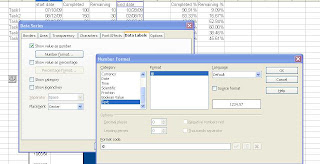
Select the Data Labels tab, then check Show value as number.
Click the button Number format ... and then uncheck the source format checkbox to change to a date format.

In the Placement dropdown combo box select Near Origin. Select No line for Borders and No fill for Areas.
Repeat the same for the Start date data series only choose the value Inside for the Placement dropdown.
5. Binding the data series dimension to the correct axis.

Select the line chart data series, completed % or remaining %
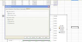
Under the options tab.align data series to secondary Y-axis.
Repeat the same for all the line series.
Ok if you got this far I think you can find the rest of the way... Let me know how it goes.


Thanks for the info.. Very interesting
ReplyDeleteSpeed Dome with 22x and 35x Optical Zoom